Sunlight as the only product
How Jacquemus turned Provence into a luxury brand, and why this strategy gets imitated but never replicated.
Analyses of campaigns, brands, collections and launches, seen through a curious eye. One review, one obsession at a time.
How Jacquemus turned Provence into a luxury brand, and why this strategy gets imitated but never replicated.
Nike released the Dn without fanfare. And that’s precisely why the campaign works.
Hurry Up Tomorrow isn’t an album. It’s the end of a character, orchestrated like a film, sold like a secret.

From neon-XL to diaphanous silhouette. How Billie Eilish reinvented her image without losing her fanbase, and why that’s rare at this level.
A brand selling as much Provençal daydream as it sells leather bags isn’t really a fashion brand. It’s a film studio in disguise.
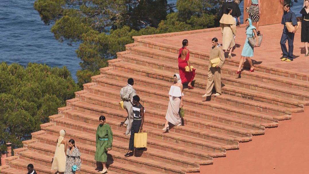
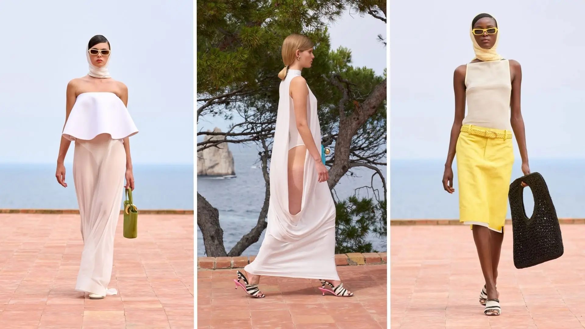
When you watch a Jacquemus show, you’re not really watching clothes. You’re watching a lavender field, a deserted beach at sunrise, a procession through the Camargue salt flats. The garments become almost secondary: they dress a narrative, they don’t carry it.
What Simon Porte Jacquemus grasped before many other houses is that fashion isn’t consumed in a boutique anymore. It’s consumed on a screen, in an Instagram feed, in fifteen seconds. And on a screen, the garment alone isn’t enough. You need light, a setting, an emotion that imprints itself in a single beat.
The genius lies in a simple reversal. Where Chanel, Dior and Saint Laurent keep filming runways, Jacquemus films landscapes through which silhouettes pass. The brand doesn’t display, it invites.
La Casa show, Casa Malaparte (Capri), June 2024. © Jacquemus. Photos: Kaitlin Serio.
The strength of this strategy rests on something often underestimated: the consistency of the imaginary territory. Jacquemus never changes mental landscape. The south of France, the golden light, the displayed simplicity, the smile: it’s a visual grammar so strict you recognise the brand without even seeing its logo.
Many have tried to copy the formula. Few succeed, for one simple reason: they copy the aesthetic without copying the discipline. The discipline is to refuse anything that might widen the territory. No urban campaigns. No autumnal palette. No dark models. The territory is sacred.
It’s also a community management lesson applied to haute couture: every campaign is designed to be captured. The giant Le Bambino bag rolling through the streets of Paris was seen, shared and parodied millions of times. It’s not an advertising visual, it’s an event that spreads on its own.
What I take away for my own projects: before asking « what is the product going to look like », ask « what is the photo people will take of it going to look like ». It’s not cynicism, it’s experience design. And before defining a creative line, you must define the territory you’re forbidding yourself.
Nike dropped the Air Max Dn without media fanfare. No celebrity headliner, no packed stadium. And that’s precisely why the campaign works.
To understand what Nike is doing with the Air Max Dn, you first have to look at what the brand isn’t doing. No 60-second Super Bowl ad. No campaign with an Olympic athlete. No slogan shouted from billboards in Times Square. The launch is almost whispered, and that’s exactly what makes it remarkable.
The Dn, for Dynamic Air, doesn’t sell athletic performance measurable in chronos or records. It sells a sensation: the feel of air circulating under your foot, pulsing, breathing. It’s an almost meditative promise from a brand that has spent forty years celebrating effort, sweat and victory.
« Feel the Unreal », Nike Air Max Dn launch film, directed by Petra Collins, March 2024.
Since “Just Do It” in 1988, Nike has sold one same story: the story of pushing yourself. The anonymous athlete who becomes a legend, the effort that pays off, the body as a tool for victory. This grammar made the brand what it is today, but it’s starting to wear thin on a generation that doesn’t see itself in the metaphor of permanent competition.
Gen Z, and especially the creative fringe that shapes opinion on sneakers, no longer wants to “push themselves”. They want to find themselves. They want calm, care, meaning. Nike understood this, and the Dn is its quiet answer to that cultural shift.
It’s a risky sidestep for a brand that built its empire on heroic bodies. Here, the hero is no longer the athlete. It’s the shoe itself. And behind this aesthetic choice lies a strategic one: make the Dn a lifestyle object of desire, not a performance tool.
Everything in the campaign serves this repositioning. The visuals saturated in orange and black evoke inner fire without screaming performance. The slow-motion shots isolating the Dynamic Air sole turn it into a design piece more than a technical device. The sound design that mimics breathing replaces the energetic beats of typical Nike spots. Everything is deliberately softened.
This restraint is its greatest strength. In an era of overload, where every brand shouts louder than the last to exist in the Instagram feed, saying less makes more noticeable. Silence becomes an event.
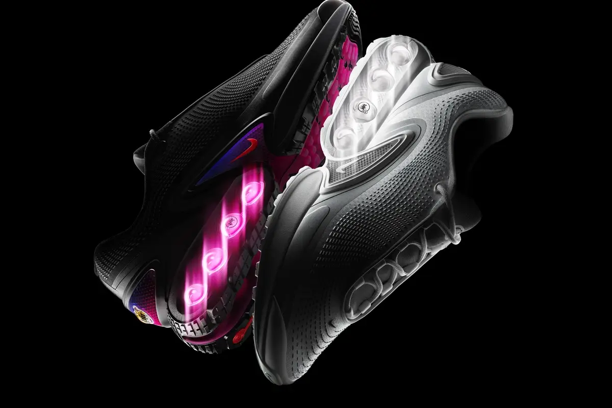
Dynamic Air sole, the new technology behind the Air Max Dn. © Nike, 2024.
The cross-channel consistency of the campaign is its most impressive achievement. The same visual language on Instagram, in stores, in video spots, on SNKRS, in launch emails. No dilution. No drift. This discipline is rare for a brand that releases dozens of models per year.
The refusal of celebrity placement is the other strong signal. No LeBron James, no Cristiano Ronaldo, not even a rising running figure. The product has to carry its own story, and it does. It’s a confidence bet that says a lot about the maturity of current Nike design.
There’s one detail that looks insignificant but says everything: the name of the shoe. “Dn” is unpronounceable, abstract, almost secret. Where competitors multiply long-winded names meant to evoke speed or science, Nike chooses mystery. It’s almost a luxury product in its treatment.
First lesson: a powerful brand doesn’t need to prove its power with every release. Sometimes the strongest signal a brand can send is its quiet confidence. Nike doesn’t need to shout its name to be heard.
Second lesson: sensoriality isn’t the prerogative of luxury. Sound, rhythm, light, texture, anything that belongs to a bodily experience rather than a rational argument can apply to sport. The Dn proves that sports storytelling can be whispered without losing its strength.
Third lesson, perhaps the most useful for anyone who wants to do communication in sports: the codes of a sector exist to be broken by the leaders of that sector. A challenger brand running this same campaign would have been misunderstood. Nike can afford it because Nike has already proven itself. Strategic rupture isn’t a whim, it’s a privilege you earn.
Hurry Up Tomorrow isn’t an album. It’s the end of a character, orchestrated like a film, sold like a secret.
For ten years, Abel Tesfaye built The Weeknd as a character: a toxic crooner, a bloody mask, a tragic hero of the night. The Hurry Up Tomorrow project isn’t a sequel. It’s an execution. The execution of the character that made him famous.
What makes this launch remarkable isn’t the music alone. It’s the total orchestration: a film in theatres, an album, a tour that literally ends on stage with the falling of the mask. Three media telling the same story, that of a deliberate artistic death.
Classic marketing would have done the opposite: maximise the lifespan of the character, multiply features, extend the franchise. Tesfaye chooses absolute scarcity. He closes the book.

Official cover of Hurry Up Tomorrow, unveiled September 2024. © XO / Republic Records.
To grasp the scale of the gesture, you have to step back. Hurry Up Tomorrow is the final chapter of a trilogy opened in 2020 with After Hours, continued in 2022 by Dawn FM. Three acts that fans read as a Dantean journey: hell, purgatory, paradise. Every cover, every clip, every tour staging connects to this narrative arc woven over five years.
This long-form construction is almost unheard of in today’s pop, where the industry pushes for inflation: a single every three months, an album every two years, a feature whenever the opportunity arises. Tesfaye does the opposite. He thinks in complete work, not discography. It’s an author’s logic applied to pop music.
Hurry Up Tomorrow comes out alongside a feature film of the same name, co-written by Tesfaye himself and directed by Trey Edward Shults. And that’s where the strategy becomes brilliant: the film isn’t a spin-off product. It’s an integral part of the album. The two complete each other, respond to each other, and only reveal their full meaning when listened to and watched in parallel.
We’ve seen this model with Beyoncé’s Lemonade, with Frank Ocean’s Endless. But here, it’s pushed further: the film doesn’t feed the album, it is the album in another form. A cross-narrative, where the film’s character echoes the musical character. And where the end of the film coincides with the end of the character. Total closure, on two simultaneous mediums.
This decision has an obvious commercial cost. But it also has a massive artistic effect: it turns every listen into an event. When you know it’s the last time, you listen differently. The scarcity isn’t manufactured by marketing, it’s real. And that authenticity changes the very nature of the product.
It’s exactly what the luxury industry understood a long time ago, and what pop often forgets: availability kills desire. Hermès doesn’t deliver a Birkin on demand. Rolex rations its Daytonas. Tesfaye applies this logic to music. By closing the franchise, he raises the value of every track in his back catalogue.
The visual campaign supports this choice with relentless discipline. No more saturated neons of After Hours. The blood red stays, but desaturated, like a fading memory. The typographic glitch on the visuals, letters bleeding into red and blue, signals the rupture, the end of the transmission.
The album cover itself is a manifesto: a close-up of Abel Tesfaye, his face bare, no smashed-up makeup of After Hours, no greying beard of Dawn FM. Just him. The character falls, the man appears. It’s probably the most emotional piece of communication he has ever produced, and the simplest.
First lesson: an artistic brand lives as much off its endings as off its beginnings. Knowing how to close is as rare as knowing how to launch. And it’s often the gesture that turns a career into a body of work.
Second lesson, for anyone who wants to do community management in music or fashion: long-term narrative coherence beats short-term virality. Tesfaye didn’t try to make buzz on every release. He built an arc over five years. The result is a fanbase that doesn’t follow a character but a vision.
And finally, the most inspiring for me: the best storytellers know when to stay silent. In an industry that survives on volume, silence has become a creative act. Tesfaye reminds us of this by closing the book when he could still write more chapters. Maybe that’s the real meaning of the word « author ».
From neon-XL to diaphanous silhouette. How Billie Eilish reinvented her image without losing her fanbase, and why that’s rare at this level of fame.
When Billie Eilish broke out in 2019 with When We All Fall Asleep, her image was as strong as her music. Neon green hair, XXL clothes to hide the body, horror-pop aesthetic. It was a political stance as much as an aesthetic one: refusing the sexualisation imposed on young female artists, refusing the pop mould, refusing to please.
Five years later, with the release of Hit Me Hard and Soft, the image has fully mutated. Natural brown hair, fitted silhouettes, diaphanous visuals, immersion in water and light. It’s almost a different artist. And yet, her audience follows her. That’s the tour de force we need to unpack.
Most pop artists who radically change image lose part of their fanbase. Miley Cyrus with Bangerz. Justin Bieber with Purpose. The change reads as a betrayal of what created the initial attachment. Billie Eilish, on the other hand, pulls off the turn without losing her people. Why?
Because she doesn’t change the DNA, she only changes the envelope. The DNA is vulnerability, introspection, the whispered voice, the refusal of the spectacular. All of that stays. What changes is the form, and the audience knows unconsciously that form has to evolve to avoid becoming a caricature.
Billie Eilish, behind the scenes of HIT ME HARD AND SOFT, 2024.
One detail doesn’t lie: the signature colour stays. The electric green that defined her first era, fluo roots, saturated visuals, reappears everywhere on HMHAS but treated differently. No more aggressive fluo. Instead, a deep green, almost underwater, that bathes the « Lunch » music video and the album cover.
This chromatic continuity does a lot. Unconsciously, the eye recognises the brand even when everything else changes. It’s a lesson directly applicable to branding: keep a strong recognition signal, evolve everything else.
« CHIHIRO », Billie Eilish, Hit Me Hard and Soft (2024).
The other remarkable element is the release strategy. No pre-album singles. No teasers on repeat. The album drops as one block, in « experience to be listened to in one go » mode, with no skipping allowed on platforms for the first few days. It’s an anti-streaming gesture in a streaming world.
The bet is huge: in the age of playlists and fragmented attention, asking people to listen to an album in order is gentle provocation. But it’s also what makes it memorable. For two weeks, people didn’t talk about potential singles, they talked about the work.
First lesson, for anyone who wants to do long-term community management: the identity of a brand (or an artist) isn’t its aesthetic of the moment. It’s what stays when the aesthetic changes. If you can’t answer the question « what must never change ? », you don’t really know what your brand is.
Second lesson: signature codes can evolve without disappearing. Billie’s neon green becomes deep green, but it stays green. This chromatic discipline over five years is rarer than it seems in mainstream pop.
And finally, perhaps the most important: the audience is smarter than you think. They accept transformation if they feel it’s sincere. They reject rebranding if they feel it’s calculated. And the border between the two is exactly what a good communicator has to learn to live in.